

Researching business card designs for a general source of inspiration with new, exciting and innovative ideas in terms of colour, layout, print finishes, stocks, and so on.
Some really great ideas and designs- really I just want to be able to produce something really new and unique which visually communicates my design practice and what I'm about as a designer (no pressure there then).

A bright sunshine yellow, just like the one I want to use within my own re-branding designs- happy, bold, uplifting and of course the colour of blonde hair (of which I have, and a lot of). Love the simple yet incredibly iconic use of the black smiley face from the 'Don't worry, be happy!' design campaign(s) of the 1980's. A picture does indeed paint a thousand words.
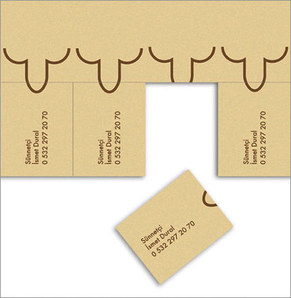
Business card for when you're in the business for a vasectomy- hilarious, but probably not so much for men. Love the innovative use of perforation. Very tongue in cheek, and a great example of the playful design that I myself aspire to create.

Great use of perforation, once again, to reveal not only the business details of the designer, but also a brilliantly vibrant, fluorescent spot colour ink below which works wonderfully in contrast to the crisp, bold white of the card stock (top layer of the duplex). The subtle differences of the weight of the designers forename and surname also work well in lowercase- a visual effect that I have been using myself, but, in the circumstance of my designs, on uppercase characters.

A really fun, interactive idea for the business card of a hairdresser. Interactivity is something that I really want to work with and push in my own designs as I believe that that is what makes a business card truly memorable and much more of a keepsake design- therefore, also remembering the designer that gave it to you in the first place.

Amazing colour palette (if i do say so myself in the reflection of my recent design choices...) love the reversed out yellow on the back side of the business card when the information and contact details can be read. The bold colour palette alone ensures that the card design stands out- no fancy die cuts, stocks or print finishes necessary. Simple and effective.

Another great tongue in cheek design, and splendid use of perforation. Fun, playful and just up my street (though perhaps not just my waistline).

Beautifully crisp duplex work with an interesting blend of spot colours and stock texture to make a really unique, character design- driven business card that is sleek, professional and oh-so sexy. One day, when I can afford the investment, I would love to get some cards like these made up (look out, third year!).
Wow adorable!You make them all so simple and cool..PSD to WordPress
ReplyDelete