Showing posts with label ougd104. Show all posts

Sunday, 24 April 2011

End of Module Self-Evaluation: OUGD104 Visual Language.


End of Module Self-Evaluation
SOPHIE WILSON
OUGD104
VISUAL LANGUAGE

1.    What skills have you developed through this module and how effectively do you think you have applied them?

I think that one of the most important things I have learnt through this module is the importance of time management. With having scheduled, timetabled sessions for this visual language module just one day a week, it could have been reasonably easy to put the work to one side, considering it something to be done “when I have the time”, etc, though, I am pleased to say that throughout the OUGD104 module, I have kept myself strictly timetabled and consistently on top of my work.

2.    What approaches to/methods of research have you developed and how have they informed your design development process?

I feel that throughout this module I have really thrown myself into the research aspect of the design process- and as a result, have grown to actually really enjoy it. Enjoyment derived from the fact that I can see how much consistent and intense research can really develop and strengthen my ideas.
Throughout this module I have read a lot more, particularly in geography, cartography and astronomy (all according to specific designs) and feel really enriched by the extension of knowledge.

3.    What strengths can you identify in your work and how have/will you capitalise on these?
I think that my Adobe Illustrator skills have significantly improved because of this module- for both the International Book Fair and What is a line briefs particularly requiring me to work on this software, and intensely, I now feel far more confident with the programme and look forward to now going on to explore more software programmes with a new level of confidence and assurance that persistence and hard work will undoubtedly help my skills development.
4.    What weakness can you identify in your work and how will you address these more fully?
I would still like to see more variation in the design outcomes within my work- not so much as an aesthetic style, but by means of method of production- having the courage to try something new and planning enough time incase it doesn’t quite work out as I would have planned.
Whilst it is certainly a benefit that my confidence has developed in one software programme, I know that I must expand my design outcomes and consider other options- not always the most obvious one.
5.    Identify five things you will do differently next time and what do you expect to gain from doing these?
   
1.    Experiment more with methods of delivery and outcomes for a wider over-view.
2.    Try to define more of a style within my work- what am I trying to say? What message do I want to visually put across to my audience?
3.    Don’t over-complicate. In a few of my earlier visual language lessons and workshops I felt that ~concepts~ got in the way of my outcomes- don’t try and be clever.
4.    Plan everything I do before I do it- this way, I will save more time, and hopefully, therefore, produce more potential design outcomes, and research more.
5.    Be more abstract and experimental with my designs- even if I don’t use the designs, be more creative with my potential outcomes to get my brain really active and possibly able to seek a new, fresher design outcome than I had previously visualised.

7.    How would you grade yourself on the following areas?
5=excellent     4=very good    3=good            2=average       1=poor

Attendance                                                      5
Punctuality                                                      5
Motivation                                                       4
Commitment                                                   5
Quantity of work produced                             4
Quality of work produced                               3
Contribution to the group                                4

The evaluation of your work is an important part of the assessment criteria and represents a percentage of the overall grade. It is essential that you give yourself enough time to complete your written evaluation fully and with appropriate depth and level of self-reflection. If you have any questions relating to the self evaluation process speak to a member of staff as soon as possible.

Papergirl Leeds: Exhibition opening night.


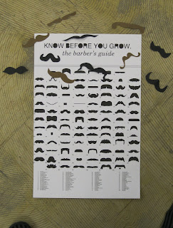
I was absoultely delighted a couple of weeks ago, on sending my 'know before you grow: the barber's guide' moustache poster to the papergirl leeds grouped to have been asked to take an active role within the exhibition- creating a papercrafts moustache instillation, inspired by some photographs I have taken in the past...

Along with my partner (who became a brilliant assistant, papercutter and photographer (I think I should be watching my back!)), we constructed the paper mobile by cutting symmetrical moustaches freehand- and then attaching them to cotton threads to suspend from the ceiling.
We decided to pick black, cream, white, brown, and orange as the colours- keeping a natural tone (for hair colours), but with the orange and red vibrantly popping against the duller, more neutral colours.
We were also "assigned" the location of a square tile panel from the roof- it was really interesting to see the moustaches in quite a gridded, structured format- as the times I had used them in the past, they had been stuck quite sparadically and abstractly. Here are some pictures Alex kindly took of the event whilst I was working...


(Please excuse my terrible face in ALL of these pictures...)

A really enjoyable few hours out, I was delighted to see the response to the small instillation work- a lot of people coming over, asking what we were upto and engaging long and wonderful talks about weird and wonderful 'taches- along with people really taking the time to stop and absorb my poster on the wall- many chuckling at it, telling their friends which moustache they would grow and even taking photographs of it. Happy times in Sophie's world.

This, though a reasonably small scale, has given me my first taste of gallery-viewings. Although I did exhibitions at college, this has been the first real time where genuine strangers have come up to me and complimented my work, which feels wonderful- my main ambition as a designer, however corny it may sound, is to make people happy- and to engage and respond to my work. If I could have gone away with just one person having a smile on their face, then I'd be happy.

Thanks so much to third year Vis Com student Laura Jordan for organising the event, and asking me to take part in this way. I feel very privaleged indeed.

What is a line?: Final Design and Resolution.


Coming to the final stages of my design process, having faced many unforseen and unfortunate circumstances, I feel very releaved and quite pleased with the results I have achieved in my work. This blog post showcases the final two days in my design and print stages...


Due to an unforseen problem with my InDesign software, and unable to access University facilities, I constructed a "mock-up" makette of my book designs- ensuring that each page would be properly formatted, trimmed, and presented.


In my final design, I chose to use a black paper with off-white cartridge paper overalay for the centre of the book, and with a black card and cartridge paper outside- with a slight margin lip around the outside for both an aesthetic and practical detail- largely to reduce the need to trim down the booklet once complete and sewn together (which can sometimes comprimise the detail or contents of the inside of the book).
My measurements were: 
outside lip: 4.5"x6.5"
inside black paper: 4"x5.5"
inside cartridge paper: 3.7"x5.3"

these measurements left me with enough room to create a clean cut and professional-looking design, whereupon no content was comprimised.

On the front cover, I decided to display a vectored version of some of the constellation atlas work I had recently been working on, and felt that this crisp computer-rendered design worked even more effectively than the hand-drawn style, and I like the minamalist, geometric look which I believe works well with the primary typeface used, GeoSans Light- an elegant, yet modern sans serif type. 


...A more formal back cover, adhering the the infographics and informative requirements of my personally-written brief.


...After initial attempts to design a singular book, I found that with my particular weight of stock, this would have produced a book that was far too thick to have enabled easy and readible information. Dividing the books into four ensured an even number of pages and constellations within each book.


...Again, I felt that a parchment bind was most appropriate for my books- unfussy and strong. Originally, I wanted to encorporate a metallic silver colouring into my designs via the method of production of screenprinting. Though reasons previously stated on my blog, this wasn't possible, however, my simple addition of a metallic silver thread as the binding material ensures the consistency within my other designs, and a pleasing aesthetic detail in the booklet series.


...the books laid flat with content easily read- the left hand side page with text left-aligned, and the right...aligned to the right!
I think this format distinguishes more of a seperation between the text and makes each constellation easier to understand- visually and mentally making a seperation within the texts, and a little more simple to read without getting too lost or "bogged under" with a text-heavy booklet. 


Overall, despite having to face many, aforementioned challenges, I am reasonably happy with how my booklets turned out. Although they are really nothing like how I originally invisaged or intended them to look, I feel I have comprimised well- an important tool in design, and has made me appreciate each process and the time each one takes just a little more. 
I feel proud of the time I have been able to turn my project and designs around in- printing, producing the booklets and binding them all in the space of a day. With enough determination, I feel that I have challenged this project and hopefully have explored and developed it to a high level.

Module Submission Form: 'What is a line?'.


MODULE SUBMISSION FORM 

SOPHIE WILSON

OUGD104
VISUAL LANGUAGE
SUBMISSION DEADLINE: TUESDAY 26TH APRIL 2011- 1PM

THEMES/SUBJECT & RATIONALE
For my last project within the Visual Language module, ‘What is a line?’, I decided to focus on the theme of constellations, and how, with marks indicating position, connection or boundaries this could translation into a Graphic Design format.
I began the project by gathering and collecting primary and secondary research- drawing inspiration from other artists, designers and imagery, along with experimenting with drawing diagrams, sketches and designs- really taking advantage of hand-rendered techniques to produce versatile and fast-paced designs.
From this, I followed my initial direction of creating a informative guide to the eighty-eight constellations, and, with some compromise along the way as to my initial visualisation of the production and methods used, have created a four-part series of books which give a brief history and basic facts about each constellation, along with a vector-drawn illustration of each of the constellations- which I hope will inform, as well as inspire future star-gazers and aspiring astronomers alike.
All work must be clearly presented and labelled with your name, module code, brief title, and any other appropriate information. Please present all work in an A2 plastic portfolio/sleeve-any work submitted in other formats should be discussed with the module tutor in advance of submission. All blog posts relevant to this module should be ‘tagged’ with the module code OUGD104.

Blogs up to date: COMPLETE
Work labelled as briefed: COMPLETE
Work submitted in appropriate format: COMPLETE 
Self-Evaluation Completed and posted to blogs as briefed: COMPLETE

I confirm that all work submitted is my own and am aware of the colleges Plagiarism Policy and that all work submitted has been appropriately labelled, formatted and tested.

STUDENT SIGNATURE
SOPHIE WILSON

DATE
25/04/11

Wednesday, 30 March 2011

What Is A Line?: Presentation and Feedback.


In our visual language session yesterday afternoon, we each presented a short 2-minute speech about our intentions for the 'What Is A Line?' brief- the statement we were basing our brief upon, the theme of our brief, the primary and secondary research we had done so far and what are intentions our for the continuation of the project, and for our final piece.

As a notorious jabber, I am fortunate to feel generally quite relaxed and happy with public speaking, so was able to (I believe) communicate my work (so far and my intentions) clearly and concisely to the group- showing a few of my notebooks with designs and sketches, along with my design context blog- http://s-wilson1013-dc.blogspot.com which has been updated with inspiration and sources relative to my constellations theme.
I believe that tutor Amber was happy with my progress and hopefully it was clear to the group how much I am enjoying the project, and am excited by the future outcomes.

Tuesday, 15 March 2011

Action Plan and Time Management: What Is a Line?


Planning the next five weeks out for our visual language 'What Is a Line' brief, in order to remain as focused and prepared for the work load...

POINTS TO CONSIDER:
-research
-theme
-processes
-techniques
-experiments
-media used

FOR 22nd MARCH LESSON: 
-Find four books to enrich my research, based on astronomy/constellations


Action and Deadline:

1. Research theme- constellations; history of constellations, location, brightness, etc.
BLOG
Preliminary ideas- sketches and idea generation.

DEADLINE: 22nd March 2011 (one week today)

2. Generating primary and secondary research- an extension of research from previous week, design developments. 
Photography/Illustrations/Embriodery, etc.

DEADLINE: 29th March 2011 (two weeks time)

3. Experimentations, directed towards your brief- screenprinting/illustration- more focused.
Book layouts, folds, etc.
Typefaces/Typeface development- creating my own.

DEADLINE: 5th April (three weeks time)

4. Creating final outcomes and designs- focusing in on my final resolution- screenprinting illustrations for book- attend screenprint sessions and book binding.

DEADLINE: 19th April (five weeks time)

5. Evaluation of project, final PPD write-up, etc.
DEADLINE: 26th April (six weeks time)


SIGNED: Sophie Wilson
and Eddie Cooper (re-writer of brief)

What Is a Line: Brief Re-Write.


With an assigned partner in the group, mine being fellow moustache enthusiast, Eddie Cooper, we went on to re-write one another's briefs- really useful in getting a new angle and perspective of the potential for our brief and plans for the project...

BRIEF TITLE:
What Is a Line
The Brief:
Explore visual representations of constellations by indicating position, connection or boundaries. What makes a line unique, and how is this put into a book format?

Considerations:

Research all lines, using a variety of sources and collect information to develop visual interpretations, compositions and layouts. Look at book binding and how it's outcome could become part of the book.

Target Audience:
-Any-one interested in astronomy

Tone of Voice:
-Informative
-Clear- not specific to any age range
-Not too scientific

Background:
A range of primary and secondary research exploring every aspect of constellations.
Photograph the stars.

Mandatory Requirements:
-Visual Samples
-Research 
-Blogging

Deliverables:
A book with all the information and outcomes.

Studio Deadline:
26th April 2011.

NB: Sorry Sophie, you pretty much had this brief BANG ON


^^love that note.

Eddie's re-write of my brief has really helped me to focus in more on my visual outcomes and ideas. I was already beginning to consider my final outcome pre-experimentation, and had thought of maybe creating a book or a poster series, so it's good to know that someone else considers this as a viable and positive outcome too.

What Is a Line: Constellations.


Writing our own briefs with a template outline for the 'What Is a Line' visual language project...

BRIEF TITLE:
What Is a Line: Constellations.
The Brief:
Explore visual representations of constellations by indicating positions, connection or boundaries- create a series exploring what links the eighty-eight constellation series, as well as what makes each one unique.

Considerations:
Research will be essential for the progression of my outcome- using a variety of sources to collect information to develop visual interpretations, composition and layout.

Target Audience:
Anyone interested in astronomy, space travel, and star gazing/constellations.
With a clear, concise and informative langauge, the guide will have a wide audience (in regards to age range).

Tone of Voice:
Informative, clear- not specific to any age range- not too formal or scientific- a beginner's guide so as not to alienate a large portion of my potential audience.

Background:
I will collect a wealth of both primary and secondary research. I will photograph stars and constellations, explore illustration and printing methods (screenprinting, monoprinting, etc.)

Mandatory Requirements:
Produce a vast quantity of visual samples and research, in order to develop and distinguish the direction and visual format which my work is most suited to.

Deliverables:
Produce a wide collection of visual experimentation and research centered around my theme- explore visual communication within outcomes- produce a visual guide of the 88 constellations.

Studio Deadline:
26th April 2011 (Module Deadline)

Tuesday, 8 March 2011

Ideas and Concepts Workshop: What is a Line Brief.


Sitting in groups, we started to brainstorm concepts and methods in how we could go about experimenting and designing for this brief.

Working with Lisa, Beth, Baljeet, and Sarah, we firstly gathered a range of method and technique approaches...

1. Photography
2. Moving Image
3. Illustration- hand trace/doodling
4. Digital Illustration
5. Embroidery
6. Book Crafts
7. Screen Print
8. 3D Crafts
9. Papercraft
10. Silkscreen
11. Vinyl Cutting
12. Collage/ De Coupage
13. Measured/Technical Drawing
14. Life Drawing
15. Typography
16. Painting
17. Monoprint/Collagraph
18. Stencils- wood, paper, vinyl
19. Mark making- engraving, embossing, etching, chemical
20. Laser cut stickers
21. Letterpress


And then gathered a range of themes we could possibly work on...

1. Constellations
2. Mazes and Labyrinths
3. Palmistry
4. Maps and Contour Lines
5. Hidden Shapes in Stacked Objects
6. Teams
7. Family Trees
8. Buildings/Silhouettes
9. Faces
10. Choose an event 
11. Choose an every day object- eg tables
12. Hair
13. Journey
14. Bird on a Wire
15. Evolution
16. String
17. Rings in a tree trunk- nature
18. Horizon- sunsets
19. Action (sports)- footballer kicking a football, etc.
20. Timeline of a life
21. Memorable events
22. Document a day
23. Formation of people- band, crowd.

****

After we discussed these points, and shared them with the group by sticking posters to the walls, we went on to fashion our own combinations- approaches to the brief. The few I wrote were...

1. Constellations in illustration- a booklet/guide to stargazing

2. Screenprinting palmistry posters

3. Papercutting strings- Making balls of papercut materials and photographing for a continous line booklet.

4. Representing music through typography- represent musical notes on sheet music by the words in the musical piece.

5. Create a moving image, animate piece about hair growth- almost a "time lapse" style- weird and wonderful hair styles.

6. Create stencil booklet of patterns involving lines- DIY book for printers and designers.

7. Create an instructional booklet on how to embroid your own constellation patterns.

8. Make an over-layed papercut booklet on how to distinguish trees- textured lines and rings distinguishing age, species, etc.

9. Make an animation (moving image) about the quintessential Britishness of ques- an info guide for foreign travellers- the dialect of Britishness.

10. Screenprinted posters based upon "the evolution of man"- could break down to parody in smaller groups:

"the evolution of the businessman"
"the evolution of the lazy man"
"the evolution of the handsome man"...etc...

11. Design a fanzine about hair types- illustrative or photographic? Quotes and typography encorporated into the designs?

12. Screenprint posters about hair- different textures.


Discussing my three favourite ideas with my group- numbers: 1, 11, and 12- they warmed to the idea of constellations, though i was unsure about the this and was favouring the hair idea, and the constellations work would take me a great deal of time to research, and this may compromise the final design quality. 

We went on to present our three favourite approaches ideas to another member of the class (not sitting in our friend groups on our table) and the hair fanzine was chosen as "the best idea"...with...

"achievable and it would be interesting to view. I think it would work really nice illustratively"

However, I was still unsure.

When I asked tutor Amber which she felt would work best, she suggested I work on the constellations idea- having looked at moustaches for my previous Collection 100 project, she felt it would push my limits and allow me to experiment more- and not run the risk of just extending a previous project.

Constellations it is!

At the moment, I am considering combining the two responses to make a fanzine based on constellations, but have to ensure that I don't stray from the brief- I will now go to on research constellations, in both primary and secondary sources to post on my design context blog.