http://www.mostardesign-store.com/store/index.php/sofia-sans-typeface-family.html
Whilst searing for contemporary sans serif typefaces to use, or to inspire my own branding design developments.
Quite concidentally, I discovered 'Sofia Sans' (being a Sophie, myself...it was meant to be), designed by Anagrama, based around one of my favourite typographic designs, Gill Sans.
Although I can totally justify spending $249.90 on the 12 x family, it doesn't mean I can afford it (boo). The typeface is so close to perfect, and I feel wonderfully reflects my bold, minimalist approach to design. Therefore, I have been inspired to go on to create my own type family, which, hopefully, can work as effectively as 'Sofia'...busy couple of weeks ahead!
http://www.maddisongraphic.com/mole-architects/
Another great source of design inspiration found today for my future self promotion and branding design developments. Perhaps most importantly for me, and to reflect my design style is to keep the brand simple, effective, and consistent. I want to primarily use black, white, and one spot colour (yellow) which will translate through a wide range of printed materials and online designs (therefore ensuring that the colour chosen in also web safe).
I really love the simple, type driven design for this range of printed media for 'Mole Architects'. Although I work primarily in illustrative design, I am worried that incorporating this too much into my design would be too narrowly focused to one particular style or design outcome (and I'm more likely to "go off" the designs as a result). I would really like to create my own typeface, or find one that I believe really represents my aesthetic style that would positively reflect my portfolio of work- these designs have proven another great source of inspiration.
http://www.behance.net/gallery/Coda-Search/1638510
Squat Design, NYC
Coda Search//Human Resource company
I was sent a link a couple of days ago to this brilliant branding design for the Human Resource company Coda Search, by Squat Design, by friend and fellow BAGDer, Joe- as he thought I would appreciate the design as a huge fan of yellow (and colour in general) and the typeface Gotham, which is used throughout the branding design.
As intuitive as ever, Joe was spot on and the design is just my cup of tea- really, exactly what I was trying to achieve with my past "dabbling" in self promotional branding, and what I now feel quite inspired to go back and redesign, with this professional, high impact design in mind- hopefully taking the inspiration of this corporate layout and design, and adding a few more elements of fun and character.
Once again, looking at more existing branding and self promotion designs in preparation for starting to create my own designs for my ~Graphic Design brand~ in the PPD session(s) this week. I already have an existing brand design, though it is rather weak, and not something I would be happy to continue using- so new ideas and concepts are a must, and I have begun extensively reseaching existing designs for branding and identity design with important factors such as colour, logo design, type, stock and variety of products (stationary) in their self promotion to consider.
The sophiticated, considered use of stock and type work wonderfully for the macron patiserrie's branding (above) as the level of visual delicacy and sophistication is kept consistent and considered. Elegant, clean, crisp
and simple.
Love the bold choice of colour and vector imagery used in this design (the colour wheel reminds me of my recent designs for my Image brief, 'Yellow & the psychology of colour', which can be found on my Design Practice blog). As a big fan of colour and colour theory, I certainly want to incorporate it into my designs and branding in a very visual, high-impact way- yellow is a definite consideration (see my previous design experiments on my Personal & the professional development blog for a closer look at existing experimentation...)
An old favourite, the monochrome, script based logo for the Ambrose Hotel identity is high-impact, sophisticated, contemporary and clean. Love the duplex and reverse printed envelopes and business cards too. Great attention to detail in their print finishes- small details which can make the brand and identity really stand out.
I do quite love the vintage- esque hipster feel to this barber shop branding which is bold, eye-catching and very visually communicative. Very edgy, very contemporary, and very cool.
The self promotional branding by/for designer Frances May (image shown above) is very simple, yet very effective. The playful use of type and considered layout works very well in terms of visual communication, minimalism and showcasing her sense of humour very effectively. Really fun and works across a wide range of media with ease.
I simply love the colours used in this branding design- bold, bright, eye-catching, and working wonderfully in contrast with the stark, bright white of the various stocks and over a range of printing methods (digital and pad printing, to name a few). The geometric shapes also give the design a contemporary and youthful character which communicates an energy and vitality of the brand well.
Love the reversed out pattern design on the reverse print for the Hollerholm branding and identity, on what I assume would be considerably weighty stock. Really simple, again, but sophisticated- definitely giving me a clear direction and example of my own taste in branding and identity design- but, to reflect my own work, I definitely think I'll need something a little bit more playful and fun- however beautifully sophisticated this branding (and many others on the post) may be.
Very simple, clean and crisp- great design! Showing the effectiveness of flooding and reversing out type, along with various other print finishes such as spot varnishing. Sophisticated and mature- very smart design.
Another old favourite, the 'This is my' branding is bold, simple, but very innovative. Finding a tag line like this works so well across a range of media and products and is really timeless. Very creative- a great example of conceptual minimalism at it's best.
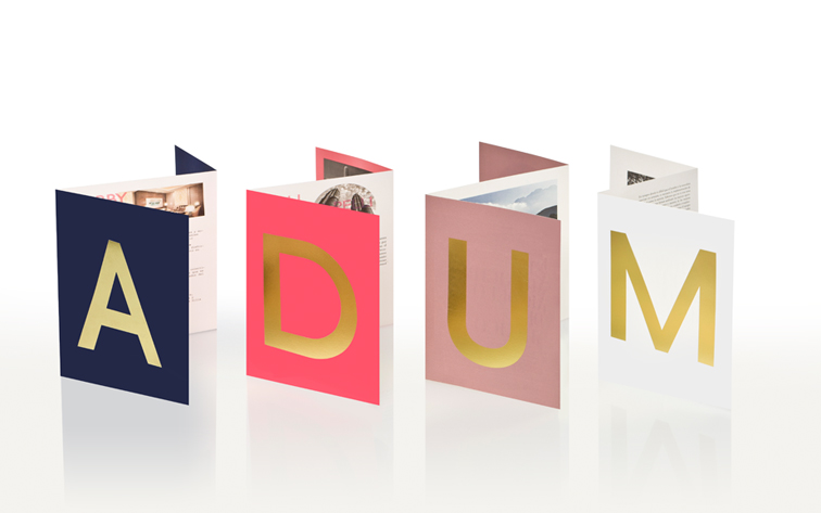
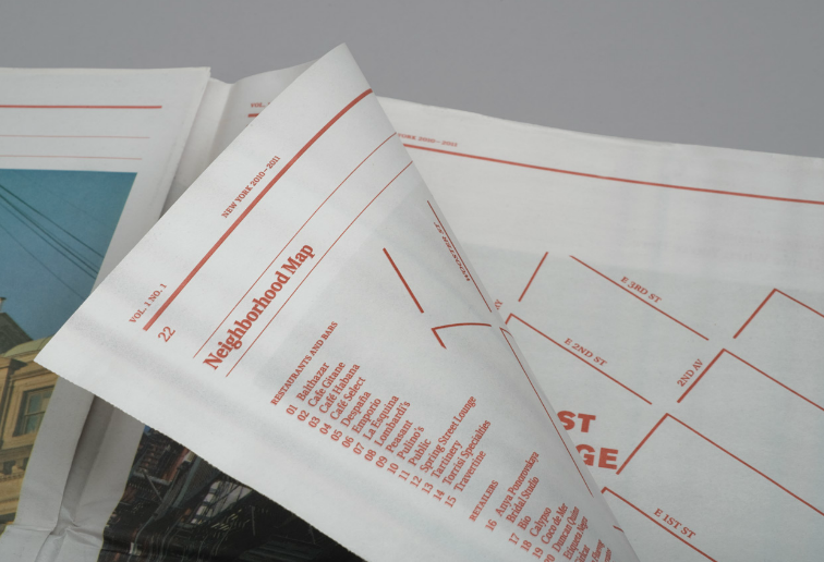
http://www.marquecreative.com/#/the-nolitan/
Probably my favourite branding design ever (...so far...) is the brand and identity design for 'The Nolitan' Hotel in New York by Design Agency, Marque.
'Nolita' translates as 'North of Little Italy', and the hotel prides itself on it's home-like feeling of comfort and hospitality in the luxurious boutique Manhattan location. From the name itself to the signage, product packaging, newspaper design- "the lot" Marque created the identity for the hotel with a minimal sophistication that really stands out amongst other brand identities, let alone hotels.
I love the consistency of the branding that works seamlessly along a wide range of product designs- even including embroidery and ribbons!
To me, this branding is classy, timeless and really so close to perfect. If I could create personal branding even half as well executed as this, I would be very happy indeed.
Another fleeting moment of inspiration that was cut short for a re-brand and self-promotion idea- geometric shapes, and, particularly, looking at triangles. In some recent designs I've seen I've been really inspired by blends of soft, pastel colours and opacities that make for really beautiful repeat pattern designs. However, starting to experiment with this in hand rendered sketches and vector-based work, again, it quickly dawned on me that this was far removed from my existing design portfolio, and wasn't really representative of my work so far. Although, of course, I aspire to constantly grow and evolve in my design practice, I certainly don't want my designs to seem unusual or alien, and feel that at this current moment in time, I need a brand and identity range that is really going to reflect what I am, and what others can currently expect from my work.
Again, more research for potential design development in terms of my re-brand and self promotion. A couple of weeks ago, when initially considering my new design direction, I considered various factors about myself that would visually communicate and represent not only myself, but also my design direction and focus. One of my major interests and aspirations is travel, and, in particular, European travel, with a deep fascination and love for Eastern Europe and specifically Russia.
As a big fan of Rodchenko-era Graphic Design, I felt that this could be an interesting starting point- looking at typography and perhaps utilising the image of Russian dolls with the idea that "the best things come in little packages" (or short packages, like myself...).
However, I felt typographically this wasn't necessarily very representative of my existing vector-based, illustrative design- and the idea of the Russian dolls may be perhaps a little too over-used. However, a fun idea to perhaps consider in a design project in the future, but not really relevant to this particular deign conundrum.