
Attempting to work on some designs for a rebrand of my own personal work, with my 'Sophie in Disguise' style, though still seemingly well received at craft fairs and by Etsy customers, feeling a bit dated and unprofessional to me now, though still fun (what I set out to achieve in the first place).
A couple of days ago, I started work on a series of new designs, but at the moment I'm still a little disappointed- largely due to the enormous lack of decision-making skills I possess, and the blessed curse that I am rarely happy with my own work (particularly in terms of branding and identity work, especially when it's for myself). An okay start, but I want to create something far more original, probably putting a little pressure on myself- but I will return again to create some more designs in a week or so and try my luck then (It can't be left too long as I need to start applying for work placements asap!).

"#FFCC00 Hex Color for the Web has the RGB values of 255, 204, 0 and the CMYK colour values of 0, 0.2, 1, 0. This web color is described by the following tags: ORANGE YELLOW, TANGERINE. Color #FFCC00 is one of the web safe colors."
I decided to use yellow for my branding for several reasons- it's happy, optimistic, bright, connotes sunshine, and, also because it's my favourite colour, one of the boldest colours, and I'm also a blonde (lots of visual communication and links to myself, my outlook and my work). This particular shade (details above) is a great tone- not too puce yellow and not too mustard- just the right balance between yellow and orange- almost saffron coloured- oh, and more importantly, it's web safe.


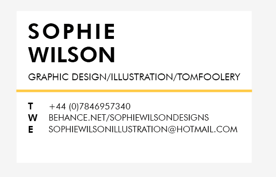


Playing around with varying media and compositions, as well as typefaces- finally deciding upon Futura Heavy and Futura Book. In a type session with Graham, I chose Futura as a typeface that I felt represented myself well- structured, geometric, logic and versatile (wishful thinking...). Also, working on generating a logo with a typeface I felt would work in balance with Futura, the script-based 'Lobster', slightly tweaked to make my own initials. However, a couple of friends pointed out just how similar it was to another BAGDer, which, whilst designing, totally slipped my mind, but they were very right. I made a whoopsie (I think the other designer's typeface of choice was 'Creampuff' which has A LOT in common with 'Lobster'). Back to the drawing board...

Working with a more calligraphic type, Widsom Script- which I had used in combination with Futura on a previous project (in Design Production for Print, which can be found on my Design Practice blog)- a few tweaks needed (in this image, the 'w' needs an outline stroke to match the density of the edited 'S')- initially I was a little concerned about the 'S' looking like a musical clef, though I actually ended up quite liking this- and, as a friend pointed out, it's quite similar to my handwriting style.


Producing a variety of designs of a range of different outcomes- receipts, notebooks, business cards, compliment slips, logo stickers, web and blog banners- still though, not happy. It seems to rigid and basic. I want something memorable, and fun. Whilst I love the colour, the whole design idea is a little too samey for my liking. Me and the drawing board are becoming strong acquaintances.
No comments:
Post a Comment