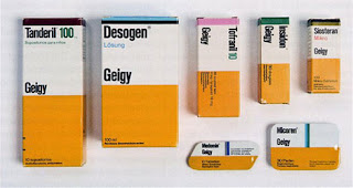
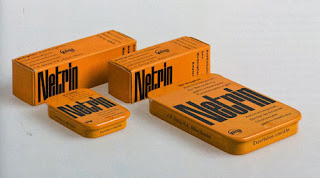
Whilst looking for inspiration for developing my self-promotional branding and identity design, one company that I returned to, as I so often do (they are undoubtedly one of my all-time favourite examples of branding design) to Geigy- the Swiss Pharmaceutical company which, in it's heyday utilised bold, block colour and simple infographic- like designs for a visually engaging and unique packaging design like no other. I particularly love this saffron- yellow colour used in these designs- really eye-catching, and it's vibrancy really pops out- fits wonderfully to my existing aspirations to use yellow as my solid colour within my designs.
Monday, 20 February 2012
Professional Development//Business Card Inspiration//Geigy.
Whilst looking for inspiration for developing my self-promotional branding and identity design, one company that I returned to, as I so often do (they are undoubtedly one of my all-time favourite examples of branding design) to Geigy- the Swiss Pharmaceutical company which, in it's heyday utilised bold, block colour and simple infographic- like designs for a visually engaging and unique packaging design like no other. I particularly love this saffron- yellow colour used in these designs- really eye-catching, and it's vibrancy really pops out- fits wonderfully to my existing aspirations to use yellow as my solid colour within my designs.
Subscribe to:
Post Comments (Atom)


No comments:
Post a Comment