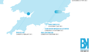
Having gone away to work on our individual tasks over the weekend, Matt returned with a business card design to fit into our existing branding for the company. However, deciding to duplex the business card with existing blue paper stock from the college library meant that this blue would differ slightly from the spot colour that Chris and Sarah have gone on to use in putting the zine together (more pictures to be shown/blogged at a later date). Therefore, for greater consistency in the "brand" image, I decided to use two blues as spot colours- the blue spot colour in the zine, as well as a swatch sample from the paper selected by Matt.
As we were now also printing in the digital suite, B&W/colour would make no difference in price, therefore, we decided to go the whole hog with the brand colours- making further edits to the design, also including adding more Bebas (the logo typeface) and the finalised logo design(s) as used by Matt on the business card designs.
I will have these printed and ready for this evening having had them cut, folded, and finished.


No comments:
Post a Comment