
Documentation of some initial experiments and designs I have been working with before decided on my finalised branding outcomes.
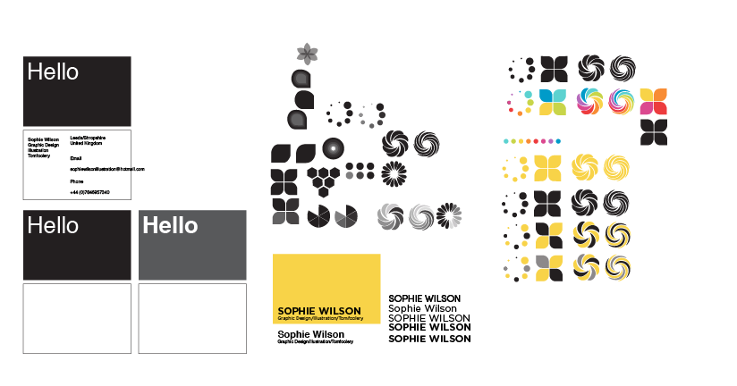
After exploring some branding concepts a few months back, I was having real problems with type, and in particular, combining my two initials, 'S' and 'W', which I felt just didn't sit well together at all. Therefore, I began exploring some image-based and type- driven designs.
After a little experimentation with image, and not really being satisfied with the level of visual communication I was conveying, so decided to return to a block colour design with type- inspired by some of the packaging of my favourite design ranges- Pharmaceutical company, Geigy, in Switzerland.
From this, my concept for a logo developed, as well as the bold use of black and white and a cost-effective and bold colour palette... slowly but surely, getting there with my designs.
I really found, taking Fred's advice, that forcing myself into creating a design in a limited time period has really helped- as it means I can make decisions at a much more rapid pace- and still have the option to change my mind at a later date.


No comments:
Post a Comment