Collecting an extensive collection of design pieces, titles and descriptions to put together to form my PDF portfolio later on today in order to send out to design studios RE studio visits, placements, and general industry placements.
Really looking forward to organising my work in a manageable and clear way, and, hopefully, gaining some positive responses from my design work as I look toward the future of my design practice and career within the industry.
Graze//YCN Collaborative Brief.
YCN Annual Competition Brief (2012)
YCN Annual Competition Brief (2012)
Submission for the YCN/Graze brief, 2012 upon which I worked with collaborative designer partner, Charlie Crosby, to create a rebranded design concept and outcomes for the Graze company, encouraged as part of our student module outcome to expand upon the brief, and look outside of the brief requirements.
Charlie and I worked towards creating the "Working Lunch" brand, where the Graze box is promoted to 18-30 year old working professionals in offices and commuting daily, with little time to spend on organising their meals for the day.
With the instillation of vendour stalls at central city train stations, and Graze branded vending machines to distribute the lunch boxes within the office, we hoped to propose an easy alternative to a high-end, premium product integration.
Our main focus was to brand the Graze company with a clear, distinctive, and minimal design approach which was suited to the smart office environments. Also working towards a much more interactive, multi-media, social networking means of communication to suit the lifestyles of the consumers, as well as to be actively more ecologically beneficial to the company and their ethical production policies.
http://www.behance.net/gallery/Black-Swan-Minimal-Movie-PostersSelf-Initiated-Brief/3721564
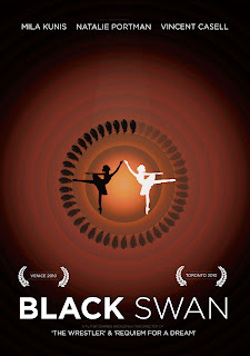
Black Swan Minimal Movie Posters
Self Initiated Image Brief
A self initiated University image brief in which I aimed to visually communicate themes from the 2010 film 'Black Swan' to contemporary cinema goers in a consistent and engaging way.
Ghosts//Illustrative type
Self initiated tome type as image brief
Self initiated tome type as image brief
Full alphabet typeface series made from an envelope object brush, inspired by Ghosts and Laura Marling's great track of the same name- as part of my self-initiated 'Design a day' yearly challenge. Day 27/365.
13/03/12-13/03/13.
http://www.behance.net/gallery/Yellow-the-psychology-of-colour/3338145
Yellow & the psychology of colour
Perfect bind printed book.
From ‘Yellow & the psychology of colour’, a perfect bind book made for retail at Leeds Contemporary Artist’s Book Fair 2012, at Leeds University, March 9th & 10.
A personal development, study and research into the psychology and symbolism of the colour yellow throughout the world.
D&AD//KesselsKramer brief//Rain in Britain.
Live D&AD brief.
Submission for D&AD ‘Rain’ Live brief by Erik Kessels for a D&AD North Lecture, discussing the subject of the beauty of rain as part of a second year Image module on my degree programme at Leeds College of Art.
Inspired by the instantaneous reaction I have to rain- impersonating Gene Kelly and fooling myself into believing I can dance.
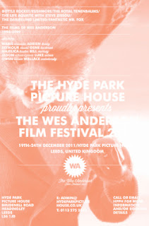
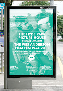
Wes Anderson Film Festival//Design Production for Print
Promotional print design for the hypothetical Wes Anderson Film Festival
Promotional print design for the hypothetical Wes Anderson Film Festival
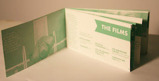
Promotional print material created for the 'Design Production for Print' module during my second year of my degree, creating a hypothetical Wes Anderson Film Festival.
Printed design outcomes includes:
Mailout box and sleeve
Information how to get to the event (maps, contact cards)
Individual hotdog fold booklets about each of the films screened
Saddle stitch book about the festival and The Hyde Park Picture House
Outdoor advertising (train station/bus station advertisement)
* Please note, the festival itself was hypothetical and has, in no way, any affiliation with either Wes Anderson or The Hyde Park Picture House in Leeds, United Kingdom.
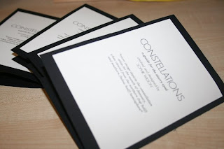
http://www.behance.net/gallery/What-Is-A-LineConstellations/3125483
What is a line?//Constellations Project
Visual Communication First Year University Brief
A first year University brief which looked into visually communicating a "line"- looking at constellations for my subject matter, and various mark-making and rendering techniques, finally settling on a series of four digitally printed and hand-binded information resource books about the eighty-eight constellations.
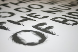
Bird feather typeface
Vector-based type as image design
Vector-based type as image design
A type as image design created for an image brief whilst studying on my second year BA (Hons) Graphic Design at Leeds College of Art.
Typeface constructed from a variety of feather vector-based illustrations to create an A1 poster with the pull quote 'It has nothing to do with the number of birds' from a published article in 'The Guardian' newspaper.
Typeface constructed from a variety of feather vector-based illustrations to create an A1 poster with the pull quote 'It has nothing to do with the number of birds' from a published article in 'The Guardian' newspaper.
http://www.behance.net/gallery/Know-before-you-grow-Collection-100Moustaches/2026639
Know before you grow: Collection 100/Moustaches
Printed media cut-out-and-keep booklet and presentational poster
A University brief, 'Collection 100' in which I chose the theme of moustaches, and created a 4-pack swatch booklet cut-out-and-keep acetate moustache guide to "know before you grow".
Along with the booklets, I created a poster, to be displayed in barbershops as a moustache styling guide for moustachioed gentlemen.
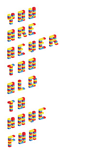
http://www.behance.net/gallery/LegoIllustrative-type/3402521
Lego//Illustrative Type
Self initiated type as image project
Full alphabet typeface series made from illustrative vector Lego bricks, as part of my self-initiated 'Design a day'yearly challenge.
Day 5/365.
13/03/12-13/03/13.















No comments:
Post a Comment