


Today, eleven of us from the Graphic Design group travelled up to Beeston to visit 'Team', the lithography printers to take a look around the studio and learn a little more about the printing process. Needless to say (see picture above...) we were a little bit enthusiastic.
(Please note Baljeet's crafty nail work)


Greeted by Simon from Team a short while later, we started our tour of the factory/work space- in a sequential route, from reprographics to print finishes. We started in the reprographics area, and were shown their timetable structure- a huge calendar chart which spread over two walls with each finish or process labelled- an efficient and proven method of organisation which ensures they can stay open for twenty-four hours a day, all year (except the Christmas holidays), providing flexible and constant business opportunities.


We then went on to see how the seperation plates were made for the lithographic printing process- in cyan, magenta, yellow and black. An interesting production method, where the aluminimum plates are processed through a computer-programmed machine.


We then moved on to the printers themselves- and examined how the paper was "knocked up" into position to ensure perfectly aligned registration in the printing process through a consistent number of units for each job. It was fascinating to see how air pressure and "suckers" were used as a grip and lock device to aid this process, along with the ruled stoppers. (Please excuse my nontechnical language...)
We also took a look at the inks- putting our inkjet cartridges to shame...


We took a look a look inside the ink reservoirs in the printers, and it was fascinating to see how the rollers worked with the plates to distribute and transfer the inks. The print technician discussed how he programmed the printers to measure the amounts of ink transferred and alterations through keys as well as the computer-aided technology.


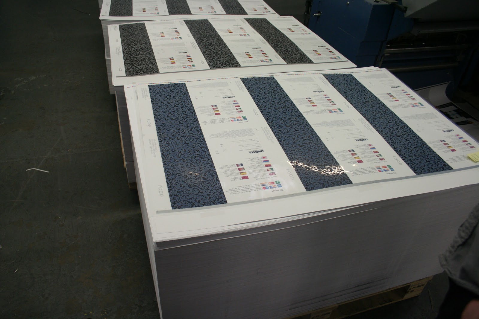
The lithographic print technician then demonstrated working on a proof- a printed brochure from Betty's tearoom in York. He was discussing how the CMYK gamut has affected the colour production- particularly from the image of the christmas pudding against the dark background.


We then moved over to to the print process finish area, where applications such as UV Spot Varnish, and trimming. It was interesting to see how the utilised their old screenprints and exposing unit for the Varnish process- a finish I was particularly interested in finding more about.


Moving into the finish (folds, bind) area, we were shown some samples of work for clients- and the palettes of printed media to be shipped out. This great paper sample booklet was from GF Smith- with all of the paper squares hand-glued on my Team in the post-print production process.
I have gone on to contact GF Smith in request of paper samples, and, hopefully, will see a positive response soon.


One of the major factors that inspired me, and made me choose 'Team' as a first choice visit was their fantastic client network- one being Italian London-based paper retailer/stockist, Fedrigoni.
I hope to take a trip down to their showroom in the near future to learn a little more about their company, and their stocks available (hopefully, again, getting my hands on some free samples!) . This print job was for the new product order method being introduced- whereupon you can order from twenty-five sheets- not just the business palette loads they previously offered.


And lastly, for the final unit tour of the building- and the final part of the printing process, where special finishes took place- foil blocking, spot varnish, die cutting and box making. It was fascinating to see all of the processes they offered within the company, which, undoubtedly is of great appeal to their client base- hence such impressive names as Stella McCartney for Adidas, Reiss, Grafik, JJB, and so on.
I was truly inspired by the visit, and amazed to see all of the facilities available for print (even spot colour and white ink digital printers- my mind...is blown), and has confirmed my passion for the design production process ever more.
A particular inspiration, which I would like to pursue- the Stella McCartney range for Adidas was printed on lightweight 40gsm bible paper- a soft, uncoated and extremely fine stock. I think the stock would represent my Wes Anderson film festival promotion that I am currently pursuing in my Design Production for Print project (see my Design Practice blog for more details) which would reflect the consideration and subtlety of his films.


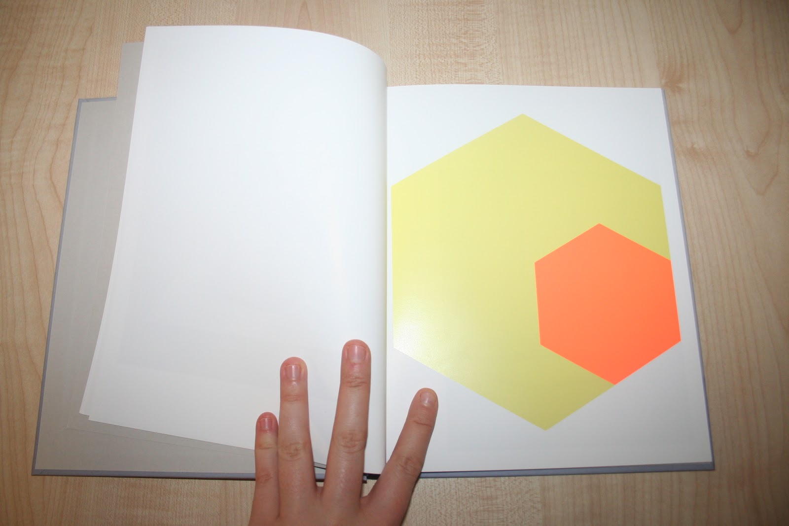


Before leaving, we were kindly given a print finish prospectus, which showcases the print finishes and processes available- as well as an innovative photographic project in which the more mundane or disregarded instruments of print were literally put on a pedestal and glorified for their usefulness and essential need in their print production process.
Really, so happy about the day- I feel like I've learnt so much, and have been awed and delighted with what is available in the print industry- the opportunities are endless. I'm definitely going to pursue more visits like these- a really brilliant day.
No comments:
Post a Comment