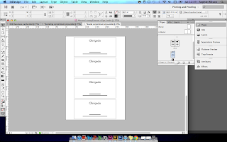
Over the Festive break I've been fortunate enough to have been able to dedicate some time to working on re-branding design for more personal branding and brand stationary, which is something I have been wanting to do for a little while.
Whilst I believed my existing branding to be fine, I wasn't entirely enamoured with it, and didn't feel as though it very effectively reflected me and my design practice, and with Helvetica type, didn't feel as though it looked very original, and could be easily lost in a crowd of brand design.
I decided to work on something, again, quite simple, in a monochromatic type- driven design which reflects my more clean and minimal design direction, using hyphens to define syllables in my name, and conveying the importance of speech, language and communication within my design and, specifically, branding design practice.
I have translated this brand design over a range of print and web- based deliverables, including branding for social networking, receipts, letterheads, compliment slips and other branded stationary, all of which has been sent to professional print through both moo.com and Genie Print in Brighton, of whom I had previously worked with for the Jessie Leong Photography branding outcomes.


No comments:
Post a Comment