Compiling a list of iconic hairdos to illustrate for my forth-coming zine. Considering creating more of a USP- perhaps hairdos of film characters- linking into my 'Filmography' project, and all-round film-nerdiness. Not sure about the number yet...50/100?
1. Holly Golightly (Audrey Hepburn in Breakfast at Tiffany's)
2. Elvis Presley
3. Marilyn Monroe
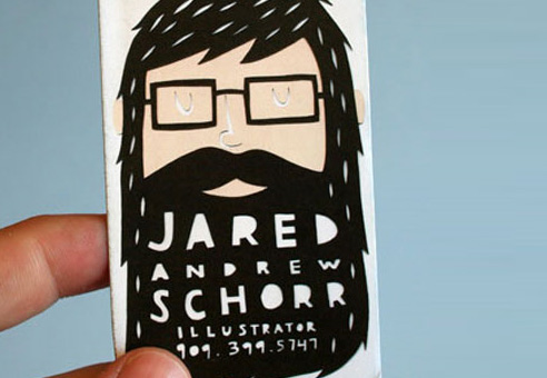
4. Rob Ryan
5. Albert Einstein
6. Moss, IT Crowd
7. Geri Halliwell, Spice Girls era
8. "The Rachel", Jennifer Aniston in FRIENDS
9. Betty Boop
10. Amy Winehouse
11. Princess Leia
12. Russell Brand
13. Captain Jack Sparrow
14. Donald Trump
15. Gandalf the Grey
16. Morrissey
17. Kate Bush
18. Simon Cowell
19. William Shakespeare
20. David Beckham (Moehawk)
21. Natalie Portman (In V for Vendetta)
22. Boris Johnson (Mayor of London)
23. Robert Pattinson (Jacob in Twilight)
24. Bjork
25. Robert Smith
26. Snoop Dog
27. Simon and Garfunkel
28. The Beatles
29. The Joker
30. Cindy Loo Hoo
31. Pai Mei (Kill Bill Vol. II)
32. Travis Bickle (Robert DeNiro, Taxi Driver)
33. Mia Farrow in Rosemary's Baby
34. Amelie Poulain
35. Clementine (Eternal Sunshine of the Spotless Mind)
36. The Bride of Frankenstein
37. Cleopatra
38. Lady Gaga
39. Katy Perry
40. Legolas (LOTR)
41. Gwen Stefani
42. Tim Burton
43. Victoria Beckham
44. Willy Wonka
45. Ace Ventura
46. Cruella DeVille
47. Draco Malfoy
48. Severus Snape
49. There's Something About Mary
50. Wolverine (X-Men)
51. Rogue (X-Men)
52. Ariel (Little Mermaid)
53. Mia Wallace (Pulp Fiction)
54. Morticia Addams
55. Superman
56. V- V for Vendetta
More to come soon!


