Showing posts with label Portfolio. Show all posts

Thursday, 7 March 2013

Personal Development III//Self Promotion & Portfolio Talk


This afternoon I was fortunate enough to have the opportunity, having been approached by the FE to HE department, to go down to the Art & Design Access Students at the Leeds College of Art college campus to talk about my portfolio and methods of self promotion to consider if pursuing a degree or career in Graphic Design. 

It was really flattering to have been asked to go along (and even better to have got paid for it...) to showcase my portfolio, discuss my work, and give advice to the Access group, as well as answering questions they had and talking about my work in general, and, overall, it felt like a really rewarding experience, and something to really enjoy.

This has also opened up the offer from the department to work on some of the printed materials for the promotion of FE to HE work and working with schools in the community to promote the college once I've left Uni which would be something really exciting to do, and a great asset to my commercial design portfolio.

Sunday, 10 February 2013

Personal Development III//Portfolio To - Do.


After two portfolio reviews from the past couple of weeks (and an edit in - between), the first with Ben Haworth of The Beautiful Meme, and the second with Tayburn in Edinburgh, I feel as though I have been given some really constructive and useful advice and feedback as I move forward with my project and design development, and, hopefully, to create the best possible portfolio outcome as I graduate and seek employment over the next few months.

Written below are important notes and a portfolio 'to do' list before graduation.

-

NOTES

* Contextualise all work - especially logos.
* Design a Day is an unnecessary project to include.
* Show photography is context. Clearly skilled (composition / appreciation for colour) - demonstrate all most effectively.
* Around 10 briefs would be best.
* Work on the photographing / photoshopping of my work for presentation.
* Think about the "bigger picture" of my concepts. Brand logos aren't the "be all and end all".
* Take out 'Write About Love' brief (logo issue... argh).
* Showcase Jessie's photography in her brief outcomes more effectively.

* Take out Wes Anderson brief - not necessarily ambitious enough / too personal.
* Bring separate folder for tactile print materials, no to- ing and fro- ing with pages.
* Take out all portfolio pages not needed.
* Showcase my developing interest in type and editorial design throughout a project in my portfolio.
* Start portfolio with a WOW... with a really bold and high - impact project.
* Don't excuse myself or projects (revealing when the projects were carried out, etc.)
* Tell a story when presenting my brief - the journey of the design and how the deliverables came to be.


Monday, 4 February 2013

Personal Development III//Re - Designed Portfolio.


This afternoon I spent some time making some quick changes to my portfolio, in reflection from my time spent with Ben Haworth, of The Beautiful Meme, in my portfolio surgery last week, in order to reprint tomorrow before my trip to Tayburn in Edinburgh at the end of the week.

Only a few small changes made- cutting down on body copy a little (but still being clear and concise, should I need to send my portfolio for studio visits, etc.) and promoting and contextualising my briefs a little more- particularly highlighting my branding and logo design with confidence, as this is the discipline and field I want to specialise in.

Thursday, 24 January 2013

Personal Development III//Portfolio 2013.


Today I finally got round to updating and redesigning my portfolio, with the addition of new work and projects and, most importantly, in preparation for some important studio visits and portfolio surgeries commencing next week.

I decided to keep the portfolio really minimal, like my work, reflecting my ethos of simplicity= effectiveness, as well as only adding the projects which I felt were really significant or demonstrate my design work well, hence having just six projects in there (perhaps a concern, but I feel positive that by the end of year show there will be at least another 3/4 projects to add from the Final Major Project module, along with other personal work). 

As the printing was been cut quite fine (with James in print at Uni fully booked up for this and next week), I decided to take the recommendation from a friend and fellow BAGDer, Baljeet, to use Dox Direct printers online. Despite being based in South Africa, prints can be sent, and received, anywhere in the world within 24 hours. Although, of course, it is costly, it's certainly worth it in regards to the quality (as shown in Baljeet's portfolio) that I'm assured will be produced.

I'm really happy to finally have a portfolio that I can start to feel proud of, particularly with the addition of more personal and developed projects, and I look forward to hearing feedback during the surgery sessions next week.

Monday, 25 June 2012

PPD//Self Branding//Revised Portfolio 2012.


The revised 2012 edition of my design portfolio which I took along for my Pearlfisher interview on Friday. For me, this was a chance to add some updated projects, such as my self branding, to the portfolio, and also to give a small snapshot of my work, as the studio had already seen my work in PDF version, but this would serve as a reminder as to the style of work, and projects I had been working on. 


Although I'm not entirely happy with the way in which the work has been laid out, or the structure of the work in general, it was a quick-turn around solution in one afternoon, as, unfortunately, things had been left rather last minute as a portfolio I had ordered came in the wrong size, and I had some difficulty on that front.


In time for my Elmwood portfolio review/interview, I look forward to putting together a far more polished and finalised body of work which clearly demonstrates my abilities and ambitions within my design practice.

Tuesday, 8 May 2012

PPD//Spread the Work//Finalised portfolio.


My first ever completed PDF design portfolio! Could definitely do with a bit of tweaking and more consideration in terms of the images (I wish I had taken/documented better pictures at the time! Unfortunately I no longer have printed evidence of some of the work to re-photograph), it suits my minimalist style of my branding and layout, as well as being very closely aligned to my CV.


Although, as mentioned, there are definitely things that could be altered, now I'm just really excited to get my work sent out, and, hopefully, gain some good feedback (I'll look to going back and re-editing the portfolio at a later date, and as my own design portfolio progresses).

Monday, 7 May 2012

PPD//Content for portfolio.


Collecting an extensive collection of design pieces, titles and descriptions to put together to form my PDF portfolio later on today in order to send out to design studios RE studio visits, placements, and general industry placements.
Really looking forward to organising my work in a manageable and clear way, and, hopefully, gaining some positive responses from my design work as I look toward the future of my design practice and career within the industry.


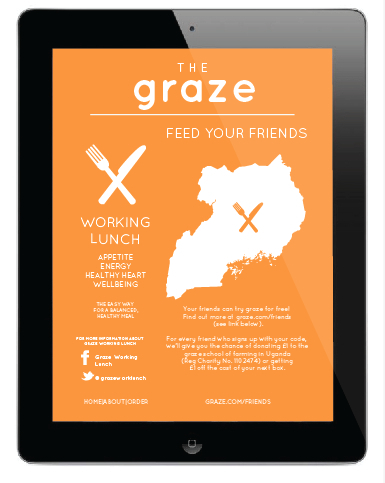
Graze//YCN Collaborative Brief.
YCN Annual Competition Brief (2012)

Submission for the YCN/Graze brief, 2012 upon which I worked with collaborative designer partner, Charlie Crosby, to create a rebranded design concept and outcomes for the Graze company, encouraged as part of our student module outcome to expand upon the brief, and look outside of the brief requirements.

Charlie and I worked towards creating the "Working Lunch" brand, where the Graze box is promoted to 18-30 year old working professionals in offices and commuting daily, with little time to spend on organising their meals for the day.

With the instillation of vendour stalls at central city train stations, and Graze branded vending machines to distribute the lunch boxes within the office, we hoped to propose an easy alternative to a high-end, premium product integration.

Our main focus was to brand the Graze company with a clear, distinctive, and minimal design approach which was suited to the smart office environments. Also working towards a much more interactive, multi-media, social networking means of communication to suit the lifestyles of the consumers, as well as to be actively more ecologically beneficial to the company and their ethical production policies.


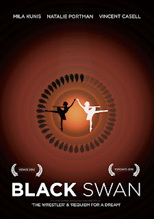
http://www.behance.net/gallery/Black-Swan-Minimal-Movie-PostersSelf-Initiated-Brief/3721564


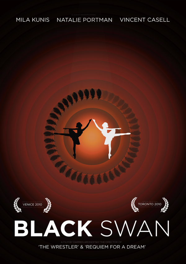
Black Swan Minimal Movie Posters
Self Initiated Image Brief


A self initiated University image brief in which I aimed to visually communicate themes from the 2010 film 'Black Swan' to contemporary cinema goers in a consistent and engaging way.


Ghosts//Illustrative type
Self initiated tome type as image brief

Full alphabet typeface series made from an envelope object brush, inspired by Ghosts and Laura Marling's great track of the same name-  as part of my self-initiated 'Design a day' yearly challenge. Day 27/365.
13/03/12-13/03/13.


http://www.behance.net/gallery/Yellow-the-psychology-of-colour/3338145


Yellow & the psychology of colour
Perfect bind printed book.


From ‘Yellow & the psychology of colour’, a perfect bind book made for retail at Leeds Contemporary Artist’s Book Fair 2012, at Leeds University, March 9th & 10.
A personal development, study and research into the psychology and symbolism of the colour yellow throughout the world.


D&AD//KesselsKramer brief//Rain in Britain.
Live D&AD brief.

Submission for D&AD ‘Rain’ Live brief by Erik Kessels for a D&AD North Lecture, discussing the subject of the beauty of rain as part of a second year Image module on my degree programme at Leeds College of Art.
Inspired by the instantaneous reaction I have to rain- impersonating Gene Kelly and fooling myself into believing I can dance.


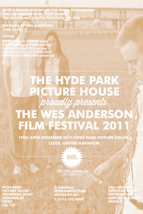
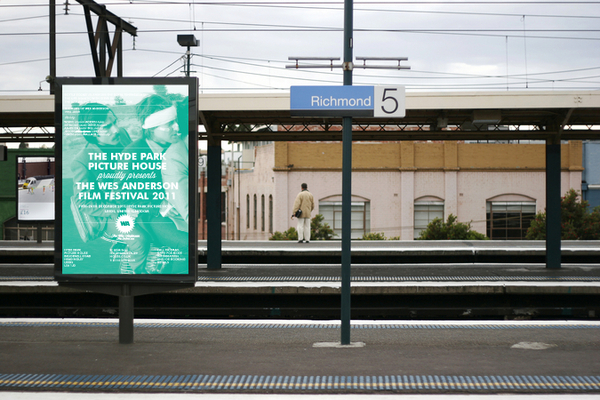
Wes Anderson Film Festival//Design Production for Print
Promotional print design for the hypothetical Wes Anderson Film Festival

Promotional print material created for the 'Design Production for Print' module during my second year of my degree, creating a hypothetical Wes Anderson Film Festival. 

Printed design outcomes includes: 

Mailout box and sleeve
Information how to get to the event (maps, contact cards)
Individual hotdog fold booklets about each of the films screened
Saddle stitch book about the festival and The Hyde Park Picture House
Outdoor advertising (train station/bus station advertisement)

* Please note, the festival itself was hypothetical and has, in no way, any affiliation with either Wes Anderson or The Hyde Park Picture House in Leeds, United Kingdom.


http://www.behance.net/gallery/What-Is-A-LineConstellations/3125483


What is a line?//Constellations Project
Visual Communication First Year University Brief


A first year University brief which looked into visually communicating a "line"- looking at constellations for my subject matter, and various mark-making and rendering techniques, finally settling on a series of four digitally printed and hand-binded information resource books about the eighty-eight constellations.


Bird feather typeface
Vector-based type as image design

A type as image design created for an image brief whilst studying on my second year BA (Hons) Graphic Design at Leeds College of Art.

Typeface constructed from a variety of feather vector-based illustrations to create an A1 poster with the pull quote 'It has nothing to do with the number of birds' from a published article in 'The Guardian' newspaper.


http://www.behance.net/gallery/Know-before-you-grow-Collection-100Moustaches/2026639


Know before you grow: Collection 100/Moustaches
Printed media cut-out-and-keep booklet and presentational poster


A University brief, 'Collection 100' in which I chose the theme of moustaches, and created a 4-pack swatch booklet cut-out-and-keep acetate moustache guide to "know before you grow". 
Along with the booklets, I  created a poster, to be displayed in barbershops as a moustache styling guide for moustachioed gentlemen.


http://www.behance.net/gallery/LegoIllustrative-type/3402521


Lego//Illustrative Type
Self initiated type as image project


Full alphabet typeface series made from illustrative vector Lego bricks, as part of my self-initiated 'Design a day'yearly challenge.
Day 5/365.
13/03/12-13/03/13.