Showing posts with label OUGD101. Show all posts

Tuesday, 23 November 2010

End of Module Self-Evaluation.


Module Code: OUDG101
Module Title: Design Principles

End of module self-evaluation.

Name: Sophie Wilson

1. What skills have you developed through this module and how effectively do you think you have applied them?

Although I know I will always be critical of my work (and rightly so!), I must admit that I am astounded at just how much I have learnt through this module so far. Before I enrolled on this course, graphics, admittedly, was fairly new to me in terms of practice and theory especially- I had no idea how to use specific graphics-orientated software, such as adobe illustrator, and had never learnt the basic anatomical features of typography. Through these past two months I have learnt more about this practice than I learnt throughout my entire two years at college.

One of the most valuable things I have come to learn and practice is the direct, industry-influenced deadlines and projects set- never before having week, or two week projects (they would, in the past, have been at least a couple of months!)- i have definately begun to understand and appreciate how important time management is in this field of work, and not only practice this, but now anticipate it- I have begun to really enjoy the challenge of this time management pressure, and although my outcomes have not always been as successful as I would have liked, I can definately say that I have learnt something from them, and this is really helping me to develop my work.

2. What approaches to/methods of research have you developed and how have they informed your design development process?

I feel that I have really broadend my outlook and view on design- now, more than ever, I am on a constant look-out for design and craft- developing a personal taste, through my design context blog, and everyday life, and am always evaluating what colours work, which don't- it now feels like a second nature!

I have always enjoyed the research process- discovering new designers, scouring through back-editions of magazines, and reading up in library chronologies, so for me, this particular area of study is certainly a pleasure and not a pain!

3. What strengths can you identify in your work and how have/will you capatalise on these?

I think my determination and comittment is one of my greatest strengths with the quantity of work I produce- although I will undoubtedly always feel that there is something more I could have done, always a design experimentation that I didn't quite have time to do, I feel very pleased with my perseverance in my projects, and I hope that my skills experience will soon catch-up, and therefore, follow suit.

4. What weaknesses can you identify and how will you address these more fully?

As aforementioned above, I think that my greatest weakness is the quality of work I produce. Although I of course try my hardest at all times in the final product(s) that I create, I certainly feel that my experience of software is lacking in comparison to the rest of my form group. I have taken certain steps towards ammending this, such as personal sessions on the adobe illustrator workshop, teaching myself a vast amount of what I now know, and these sessions, and personal practice have made me feel a lot more confident with my future progress, and I hope that this feeling continues, and becomes evident within my work.

5. Identify five things that you will do differently next time, and what you will expect to gain from doing these?

1. Consider and plan my processes before I persue them: I have found myself "re-visiting" a lot of design ideas mid-way through projects- if I give more consideration at the start, this will save a lot of time in the long run.
2. Practice my software skills: Practice during any free time I will have to develop a deeper understand and practice, again, this will definately prove a time-saver in the long run.
3. Develop more of a self-evaluation throughout my projects: this will help me to realise problems at an earlier stage, and be able to produce a higher quanity and quality of work within the resolutions. 
4. Experiment more with methods and techniques- both in practice and free time, to develop and understand what I believe to be a personal style, and to gain experience of all the processes available.
5. Develop work directly inspired by others: whether it's a personal like or dislike, this will give me a much wider view of the practice and tastes in graphic design, and help to keep my mind more unbiased and open to new ideas and aesthetics.

6. How would you grace yourself on the following areas? :

5= excellent
4= very good
3= good
2= average
1= poor

Attendance: 4
Punctuality: 4
Motivation: 4
Commitment: 5
Quantity of work produced: 4
Quality of work produced: 3
Contribution to the group: 4

Friday, 19 November 2010

Alphabet Soup: Typographic Re-Design.


In response to feedback, I have begun to re-evaluate and revise my Alpahabet Soup typography design, inspired by Chloe's personal tastes and interests.
Although the critiqueing gave me the feedback and opinions that perhaps my designs were too elaborate (and therefore not communicating as effectively as they could), the basis of the design was still solid and promising- particularly the letterforms which I based my designs upon- and therefore, decided to go back to this point, and reviewed and analysed a few more font series of the same style (traditional, serif) to work with.

The font above: felix titling font through adobe illustrator- classic, bold- unusual curvature to the glyphs- the question mark and ampersand don't really look as if they come from the same series?

Arabic Typesetting typeface- fluid, smooth lines- really like this typeface, though perhaps too much empahsis on the serifs- quite bold in comparison to the curvature of the bowls, counters, etc?...


Andalus Regular- A bit too "OTT" in the italic style of the glyphs.
 

Andalus Lowercase Regular- I prefer this lowercase style to the uppercase above, but I still find the italics a little uneccesary and elaborate for Chloe's traditionalist, straight-forward personality.
Century Schoolbook lowercase- definately my favourite typeface, and, of course, the lowercase version that I used for Chloe's original, though, unusually, this is the first time I have used it (Chloe originally stated her preference for uppercase- but perhaps it is time I went against her request, for the purposes of experimentation, of course!)


After several experiements with the century schoolbook lowercase typeface, I am pleased with my final design I have created (directly above), in a style which, in reflection, I believe suits Chloe a lot more than my original design, and infact refelecting on this re-evaluation experience- a classical style with two very different sides- shown in both her personality and used in my colouring contrast of black and white tones, weight of line, etc...


End of Module Self-Evaluation.


Module Code: OUDG101
Module Title: Design Principles

End of module self-evaluation.

Name: Sophie Wilson

1. What skills have you developed through this module and how effectively do you think you have applied them?

Although I know I will always be critical of my work (and rightly so!), I must admit that I am astounded at just how much I have learnt through this module so far. Before I enrolled on this course, graphics, admittedly, was fairly new to me in terms of practice and theory especially- I had no idea how to use specific graphics-orientated software, such as adobe illustrator, and had never learnt the basic anatomical features of typography. Through these past two months I have learnt more about this practice than I learnt throughout my entire two years at college.

One of the most valuable things I have come to learn and practice is the direct, industry-influenced deadlines and projects set- never before having week, or two week projects (they would, in the past, have been at least a couple of months!)- i have definately begun to understand and appreciate how important time management is in this field of work, and not only practice this, but now anticipate it- I have begun to really enjoy the challenge of this time management pressure, and although my outcomes have not always been as successful as I would have liked, I can definately say that I have learnt something from them, and this is really helping me to develop my work.

2. What approaches to/methods of research have you developed and how have they informed your design development process?

I feel that I have really broadend my outlook and view on design- now, more than ever, I am on a constant look-out for design and craft- developing a personal taste, through my design context blog, and everyday life, and am always evaluating what colours work, which don't- it now feels like a second nature!

I have always enjoyed the research process- discovering new designers, scouring through back-editions of magazines, and reading up in library chronologies, so for me, this particular area of study is certainly a pleasure and not a pain!

3. What strengths can you identify in your work and how have/will you capatalise on these?

I think my determination and comittment is one of my greatest strengths with the quantity of work I produce- although I will undoubtedly always feel that there is something more I could have done, always a design experimentation that I didn't quite have time to do, I feel very pleased with my perseverance in my projects, and I hope that my skills experience will soon catch-up, and therefore, follow suit.

4. What weaknesses can you identify and how will you address these more fully?

As aforementioned above, I think that my greatest weakness is the quality of work I produce. Although I of course try my hardest at all times in the final product(s) that I create, I certainly feel that my experience of software is lacking in comparison to the rest of my form group. I have taken certain steps towards ammending this, such as personal sessions on the adobe illustrator workshop, teaching myself a vast amount of what I now know, and these sessions, and personal practice have made me feel a lot more confident with my future progress, and I hope that this feeling continues, and becomes evident within my work.

5. Identify five things that you will do differently next time, and what you will expect to gain from doing these?

1. Consider and plan my processes before I persue them: I have found myself "re-visiting" a lot of design ideas mid-way through projects- if I give more consideration at the start, this will save a lot of time in the long run.
2. Practice my software skills: Practice during any free time I will have to develop a deeper understand and practice, again, this will definately prove a time-saver in the long run.
3. Develop more of a self-evaluation throughout my projects: this will help me to realise problems at an earlier stage, and be able to produce a higher quanity and quality of work within the resolutions. 
4. Experiment more with methods and techniques- both in practice and free time, to develop and understand what I believe to be a personal style, and to gain experience of all the processes available.
5. Develop work directly inspired by others: whether it's a personal like or dislike, this will give me a much wider view of the practice and tastes in graphic design, and help to keep my mind more unbiased and open to new ideas and aesthetics.

6. How would you grace yourself on the following areas? :

5= excellent
4= very good
3= good
2= average
1= poor

Attendance: 4
Punctuality: 4
Motivation: 4
Commitment: 5
Quantity of work produced: 4
Quality of work produced: 3
Contribution to the group: 4

No News Is Good News: Message and Delivery Final Design.


Here, I scanned one of the envelopes I previously constructed and traced it into a vector design for an Illustrator template for my designs- simple, economical.


After placing the elements of my envelope design in situe, I intially had some difficulty entering anchor points to delete certain lines (so that they wouldn't be visable in print). Therefore, I deleted all the lines with the intention of tracing the outline once printed from my pre-constructed paper envelopes.
However, after printing I realised how difficult this would be to align accurately, and decided to attempt to work my way around this problem...


My design placed in the correct envelope situe with lines still present.
I printed this off for a tester, but was dissatisfied with the results- when folded, the two oxfam logos are uncentral, and to ammend this, the web address would be unaligned, and therefore wouldn't look very consitent with my poster design...


Thus, I removed the logo on the back fold section, and was much happier with the results when printed, a far more subtle and sophisticated design.


In attempts to ammend the issue of the black lines appearing come print, I coloured the lines with the same pantone colour as the newsprint swatch, as I had used in my other designs, therefore, come print, being unoticeable.


And here, my final design- with the newsprint pantone background colour, and full mailing address, ready for print, and then to have been sent by tuesday/wednesday, to be delivered to my tutors by friday morning, on the concluding day of this project brief.


For my reversable-side fold-out poster, I obviously wanted to keep my design continious to my mail shot design, therefore, I decided to promote a sample few beneficary gifts that would be available for purchase from the 'oxfam unwrapped' site.
"Goat Couple: £50.00 Here's the "buy one, get two for twice the price" offer." was undoubtedly my favourite example on the site and I thought that the double vector design composition of the goats would symbolise the fact that the gift is shared, loving and unselfish.


I went on to design other elements of the gift selection and developed my original hand-rendered illustrations, including fresh water, chickens, and essential medicines- centre aligning for a bold composition with consistency in colour and my style of design.


Again, like my mail shot, I concluded by adding the newsprint background colour, and I am really pleased with how much of a visual affect this has given- the colours seem a lot less offensively bold as they were on the white, and I am sure that the texture of printing on the newsprint paper will just make it all the better!


The final element of my 'No News Is Good News' task three project: the A4 newsprint mailing list to accompany my mailshot designs- each with a specific address on to companies or individuals of whom may share an interest or services relative to my chosen theme of beneficiary gift donates in third-world countires.


The final part of this 'No News Is Good News: Message and Delivery' project- my arrived mailshot.

So pleased that it arrive efficiently and on time to the University for the project hand-in on Friday morning, if a little battered, bruised and grubby! Thank you Royal Mail!

Saturday, 16 October 2010

alphabet soup task 2 evaluation.


Personal evaluation from my alphabet soup task 2 project:

Referring to the typeface you have designed answer the following:

Which personality traits did you choose to respond to and apply to the typeface?
I found myself initally quite confused as to which direction my typeface should be taking. Even from the brief conversation I had with Chloe on the first day of briefing, in those short ten minutes, I was mentally bombared with lots of different personality traits that Chloe had- each not very specific or dominant, therefore, I had my pick as to which I should focus on.

When it came to designing the typeface, I decided to settle on perhaps the most fun and creative choice- her free-spirited personality combined with a subtle elegance, also relating to her rural upbringing in Cambridgeshire- which was a really prominent, and obviously important factoe in her life.

What are the reasons behind the design decisions you have made from the typeface?
Really, in hinsight, I perhaps involved too many elements within my typeface, and as my tutors rightly put it "tried to please everybody".
I decided to try and encorporate several elements of Chloe's personality and personal tastes- using uppercase, serif letters as she requested, with a classic font (based upon Century Schoolbook) and a bold style to reflect her personality.
I went on to fill the typeface with a natural texture reflecting roots (inspired, initially, by mangrove roots), woodgrain, bark, etc- to represent her countryside up-bringing.
I then us

In what ways are the results effective?
I think, in context the design works, but perhaps not so much in aesthetic terms as I originally would have wanted to- I am going to work on experimentation and development of the series to see how I can progress with my visual communication.

alphabet soup, task 2: the final outcome.


The picture above shows a section from my A1 typographic final outcome sheet, designed and inspired based upon the personality of classmate Chloe Wilkinson, as I have stated in previous posts.

After many, many hours of hand-drawing and tracing my letters, I was very pleased and relieved to have finally completed the sheet ready for our presentation crit at 1.30pm on the 15th october.

It was great to work with five other pairs to see the variety and thought process behind each typeface, and I felt genuinely inspired by what people had created.


 Different scales of scanned (originally hand-rendered) and printed name badges- the top used for the 4.5x9cm badge scale.
I was very glad to see that the type mainted both it's readability and legibility, despite the increasingly reduced scale.

When it came to our presentation, I got some really useful feedback from Chloe, fellow classmates, and my two tutors, Amber, and Jo alike- all the comments completely justified, with many of the points I could understand, or had even anticipated being mentioned before the crit- issues that I could ammend with the typeface, or try to improve for the module hand-in date in November.

The main points and issues raised were:

-the type looked a little hair- like, perhaps not communicating the concept of nature's textures as effectively as i could.
-try to define the style- take a step back from my thought process and try to make the concept less complicated. simple is often more effective!

actions to be taken are:

-experiment in lower case, to see how versatile the font is
-work with other textures: wood, vines, grass, feathers- think natural!
-try both a more feminie style font, as well as a bolder, more masculine font- really EXPERIMENT!
-control the contrasts!


throughout the next week i am looking forward to playing around with lots of different styles and directions in which my typeface may take, and seeing how much further i can push myself out of the comfort zone and into a new mindset brimming over with creativity!


Friday, 15 October 2010

design principles for the 'how to' project.


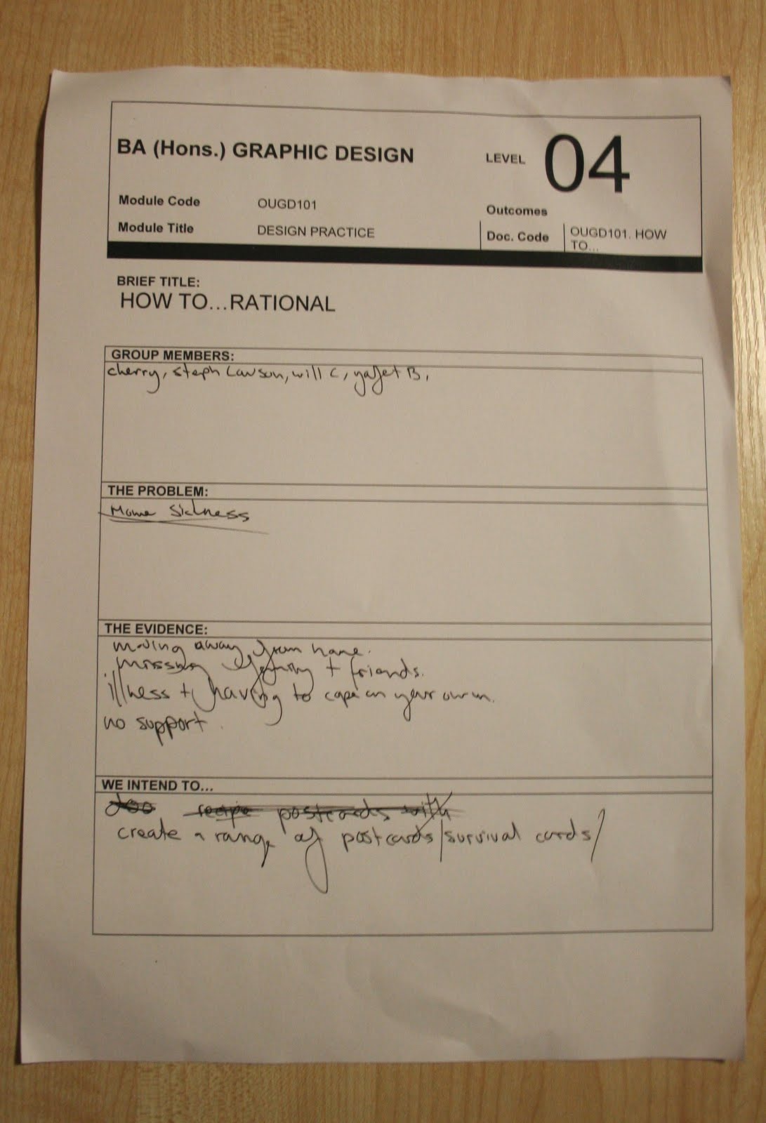
Here's my project rationale for our first 'How To' project...goodbye blog continuity, hello mess!

Today, we launched off on our first level 04 project, entitled "How To" in which we were assigned groups to create graphic resolution to a particular problem that we as students face.

In a group with Yafet Bisrat, Simon Cherry, Will Cotterill, and Stephanie Lawson, we were chosen the "problem" of "missing home" to solve through the aforementioned fashion.

After brainstorming several resolutions and potential outcomes, we were asked to select three and record these on sheets of paper, as shown below:


(hmm, really should start taking more care of my sheets...)


Our fate was then placed in another group within our year base, and I was delighted when they chose the first option (tote bag design) as the graphic resolution we should create.

Within our group, we intend to create the previously mentioned solution to homesickness, and therefore, we have decided to each design a tote bag within a certain theme to either give a nostalgic, wistful and warming memory of home, or the optimistic and high-sprited oppurtunity for a fresh start, and new beginnings, such as a new found independence and experiences.

I am very pleased to be designed a tote bag in the theme of home-baking, (my speciality!) reflecting the home comfort that so many of us have been privaleged to experience.

I hope to encorporate text and hand-rendered illustration for my designs, which I shall go on to create both tonight and throughout tomorrow, and which I hope to present on my blog shortly.

alphabet soup, task 2: week 2.


With one week until our final critical analysis presentation, I had to really begin to think about the style and format my typeface was going to be represented by. 
From my previous posts, you can see that I quite liked the flow in which the design plan was taking, but not necessarily the finished outcome. 

Though I liked the ideas behind my last 'F O N T' design idea sketch-up, it didn't take a mid-project briefing analysis for me to know that it wasn't quite right- the lines too heavy, perhaps too bold, and lacking in any particular continuity through that design idea stage.
However, after a frantic sketching session in desperation to find a new source of inspiration, I found that I already had the basis of my typeface all along, it just needed a few little adjustments.

The letter 'P' above comes from my final design idea- very similar to the 'F O N T' letters, but this time, far more subtle- taking greater care over the weight of line, the elegance and flow of the line, and the balance of negative space with shading and colouring. 


I was really pleased with the outcome when I tested the technique on various letters and glyphs, as it proved really easy (though a little time-consuming!) to create a different aesthetic, direction of line, etc, for each one, whilst still maintaining the look of a series as was required.

I am really pleased with the subtle difference I made as opposed to having a complete overhaul in the direction in which my typography was taking. I still believe that it reflects many aspects of Chloe's personality traits and interests:

-the bold, classic serif font (based upon 'century schoolbook')
- the series style, consistency and continuity
-monochrome/neutral tones and colouring
-nature-like texture: relating to her rural upbringing, favourite book 'wild swan'

I will now go on to trace my twenty-six letter alphabet and six-glyph series onto a sheet of A1 trace paper and create a name badge measuring 4.5x9cm with Chloe's name.

Monday, 11 October 2010

alphabet soup task 2 week 1 critical analysis.


week 1 critical analysis and review

 After several days of uncertainty and confusion as to where my project was taking me, I decided emerse myself in ideas, and spent a long time scribbling and doodling quick designs- experimenting with weight of line, textures etc. Although there were lots of potential ideas and designs available for development, I really kept on coming back to this organic wood-grain-like texture (see above), that, with the more I looked at it, the more it reminded me of streaky bacon. Anyway...

Whilst re-evaluating my designs, I tried to steer away from the literal presentation of my adjectives, words like "elegant" and "feminine" seemingly mundane, with so many expressions of these words already within typography and graphics, I didn't feel as if the ideas were at all original.

I thought about some of the other points Chloe bought up- the fact that she was bought up in the countryside, and her favourite book, named 'Wild Swan', which inspired me to re-discover the wonderful graphics work of Si Scott, and in particular, a swan illustration...


I really like the variation in the weight of line and curvature of this hand-rendered piece, and felt really inspired by the natural, elegant flow.

Therefore, I skecthed up the quick 'F O N T' design (at the top of the page) in response to this. After a really productive and helpful progress crit on the afternoon of Friday 8th, I gained some really helpful and productive advice- the vast majority of which i agreed with, and intended to infact go on to do myself.

The most prominient points were:
  • ensure that the letters link together in one particular style for fluidity.
  • keep elegant and more subtle- less block colour perhaps?
  • consider the weight of line and thickness of stroke- needs to be more styalised.
  • Try out different scales of the typeface- ensure that it is both readable and legible in varying sizes.
  • Practice the "wrap-around" style in different ways (as in the 'O' letter).
I'm really looking forward to developing this further next week and be able to present a professional and creative alphabet and glyph collection inspired by Chloe on the final presentation assessment on Friday 15th October.

Friday, 1 October 2010

Alphabet Soup Evaluation.


Visual Thinking: Design Principles

This short run-through of questions and answers show my opinions and thought after our group crit from the past week's 'Alphabet Soup' project.

Name of designer: Sophie Wilson [sw95224]
How well does this answer the brief?: In hindsight, and reflection from fellow team members within my group, I can see that I certainly went off on a tangent throughout my work. I was, admittedly, having real trouble grasping any inspiration at the beginning of the week, and with only a few days left, I decided to follow along with the concept as oppossed to the font style, which I have discovered now was a valid route, but not neccessarily the emphasis on the font that was desired in the first place.
How well has the idea been visually explored?: If there is anything that I can come back from with positivity in this project it's the outcome of my final designs. I was rather determined to create cut-out designs to create a softer aesthetic that the clincal sounding word 'divide', and although it was undoubtedly very time consuming, i'm still very glad i did it. Again, although I was pleased with my designs, from my feedback I can see that it didn't neccessarily meet to the design criteria, therefore, I shall need to experiment more in the next few days to catch up on my work.
What are the strengths of the resolution?: As i have previously mentioned, and was bought up by many of the members within the group crit, they quite liked the concept and ideas behind the type series. I will be the first to admit that at first the concept is not entirely obvious, and explaination is vital- therefore, it isn't as visually informative as I would have liked.
How could it be improved?: Again, as I said, from the briefing, I really didn't understand the typeface direction that my work should have been following. Therefore, whenever I have some free time (preferably over this weekend) I will show more experimentations and try to develop my ideas further and more creatively (sort of like working backwards- though hopefully this will give me more background support for this project).
General comments...: I have come back from my feedback session, to be honest, feeling quite deflated with the response. I have worked very hard to create this set, and it's just unfotunate that i misunderstoof the brief from the very beginning. I will do my very best to ammend this project and catch up on any work, however, there is a very small time window to achieve this before my next project brief, so, really, it will be just a matter of time management.
I will, however, at very least, ammend three of the series of letters to a black background (as suggested to avoid distraction from the others) as suggested by my fellow crit members, and then attempt to analyse and ammend my work.

Thursday, 30 September 2010

alphabet soup.


Final design and reasoning in my alphabet soup series.

DIVIDE: TO SEPARATE INTO PARTS, SECTIONS, GROUPS, OR BRANCHES.

After suffering a few numb brain cells earlier in the week, and many design ideas and drafts that didn't seem "quite right", I finally brainstormed and developed a series of typography cards to represent the word "division" (of which I have chosen to specialise in the field of science and mathematics).

From some of my initial ideas i wrote down, such as "nuclear fission" and "the conception of twins", I believed that I could create both a really innovative, yet subtle series of letters, which would be clevery crafted and styalised, without being too "obvious".

From my initial sketches and notes on my nuclear fission designs (see previous blog entry) I decided that for this series I would really like to work with the letter 'H', for two reasons:

1. I was very drawn to the uniformity and symmetry of the letter 'H', and believe that I had a lot of variations available- as the letter 'H' can be visually presented in several ways.
2. In relation to science, I was drawn to using the letter 'H', as it is the first symbol on Dmitri Mendleev's periodic table, standing for the colourless gas, 'hydrogen, and baring the atomic number '1'- I have always been fond of creating subtle significance within my work.


I used the bold serif 'H' above as a basis template for my letters, but then decided to create a more "industrious" and uniformed look, sqauring the edges and adding extra boldness to the design.

After realising the basis for my letters, I went onto research particular subject areas which I could communicate visually, both in connection to science, and the aformentioned chosen word/theme, 'divide'.

Although I have a keen interest in science, I am undoubtedly not an expert (as my GCSE results paper would tell you), so I went on to research elements of nature and chemistry in which division, or seperation, of some kind occurs- referencing books within the university library, as well as sponging my Dad for advice (he used to be a practicing science practioner, luckily for my research!).

After researching for several hours, I concluded to work on these ten particular areas:

1. Nuclear Fission- the nuclear reaction in which a massive nucleus splits into smaller nuclei with the simultaneous release of energy.
2. The Combining reaction of Chemicals- Linking on from the topic above- visually presenting the wonder of chemicals- how single elements combined make something lager, exciting, new.
3. Muscle structure- Each tendon working both singularly and in harmony with others to move the human body and add a structural wall between our skin and vital internal organs (along, of course, with the skeleton).
4. The Tongue- Each section of the tongue recieving different sensory messages- sweet, salty, sour, bitter. Even on such a small surface area, each taste bud has an individual job and receptor.

(map diagram found from online sources to showcase the sensory taste buds upon the tongue)

5. The rib cage- Protecting vital major organs- incasing both lungs and heart. Each with seperate functions, but one could not survive without the other.
6. Blood- Incredibly vital in our lives- offer blood transfusions to those in needs- chemotherapy patients, medically trying labours etc. We all have blood within our bodies- but we each have our own specific blood group- cannot be mixed through transfusions, and must be clarified in these circumstances.
7. Veins and artries- Heart pumps blood through the arteries. They branch out into microscopic capillaries, then rejoining to form veins, carrying blood back to the heart.
Only the arteries from the left side of the heart reach down to the fingers and toes, the right side arteries are dedicated to the flow of blood to the lungs.
Again, I was very interested in the seperate functions of the same product within the body- a fascinating network of bizarre and complex system mapping occuring within our bodies each and every day.
8. The Conception of twins- 1/90 pregancies result in the conception of twins, 2/3 of these are non-identical. identical twins develop from the same fertilized egg in the womb, and always share the same gender- along with sharing the same placenta, amniotic membrance, and, when born, genes.
This idea particularly interested me, as the idea seemed so clear- one egg, divided to make two lives- though incredibly similar, both unique and their own self.
9.The Skull- made up on several plates, perhaps like a jigsaw- but  must be formed in order to "perform" it's function efficiently.
10. The Nervous System- essentially, the system which allows receptors to be carried to our brain to perform movement in the 30, 000 miles of nerves within the human body.
The nervous system consists of two main controls: sensory nerves (messages to the brain from eyes, ears, skin, and other sense organs), and motor nerves (other parts of the body, e.g, limbs, which allow us to move).


(l-r from top: muscles, tongue, ribcage, blood, nuclear fission, veins and arteries, chemical elements, the conception of twins, the skull, and the nervous system).

In these images, I have carefully thought over and planned why each is aesthetically presented in such a way:

1. muscles- the red strips demonstrate the directional positioning of the muscles and tendons on the pectorials and chest area on a human.
2. tongue- quite a playful one! I liked the idea of the H "sticking it's tongue out". Each coloured section on the tongue represents the correct postioning of the taste buds:
- dark pink: bitter
-yellow: sour
-blue: salty
-purple: sweet
3. ribcage- an incredibly simplified version of the ribcage. I wanted to create a childlike look about this design, and the set in general. Unfortunately, science is becoming decreasingly popular throughout the education system, and therefore, I believe, needs to be resolves in perhaps a more managable and fun way.
4. blood- a simple, bright red blood splatter upon the hard contrast of the black background.
5. nuclear fission- black and white to represent the colourless element of Hydrogen, with two black dots- symbolising the atomic structure of hydrogen (a central proton, outter electron).
6. veins and arteries- an abstract presentation of blood flow.
7. chemical elements- the split 'H' showing the division of chemicals, with smaller 'H''s stemming from them, showing the development of chemical reactions.
8. the conception of twins- double shadow of the letter 'H'- colours representing the cross section of the womb with two small foetuses intertwinned.
9. the skull- simplified cream jigsaw- representative of the human skull.
10. the nervous system- blue directional lines cut on cream background- to show the direction and purpose of the nervous system in a styalised manner.

Of course, if I had the option, I would really have liked to have produced more design work to back up this project, but from particular circumstances, and the week deadline, I think that I have done reasonably well to have completed this project in a style which I can optimistically say that I am rather pleased with.

Although my outcomes may not seem entirely obvious, as aforementioned, they each represent a simplified response to each of these matters.
What I liked most about my particular subject is that they were all very much so seperate functions and controls, but without the aid of others, they would simply cease to be.

You can't divide without multiplication waiting right around the corner.